Branding Project
Moonkid
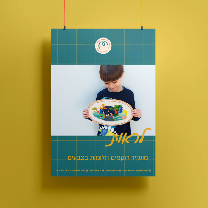
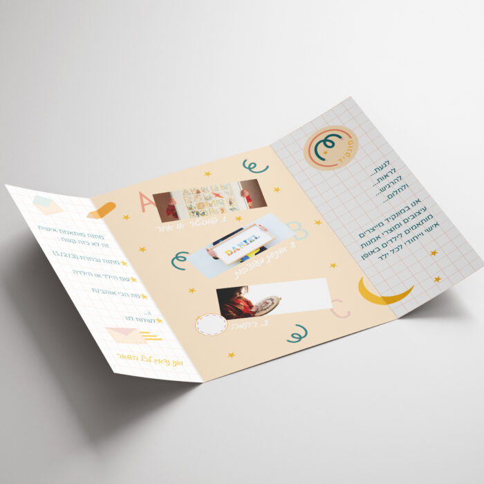
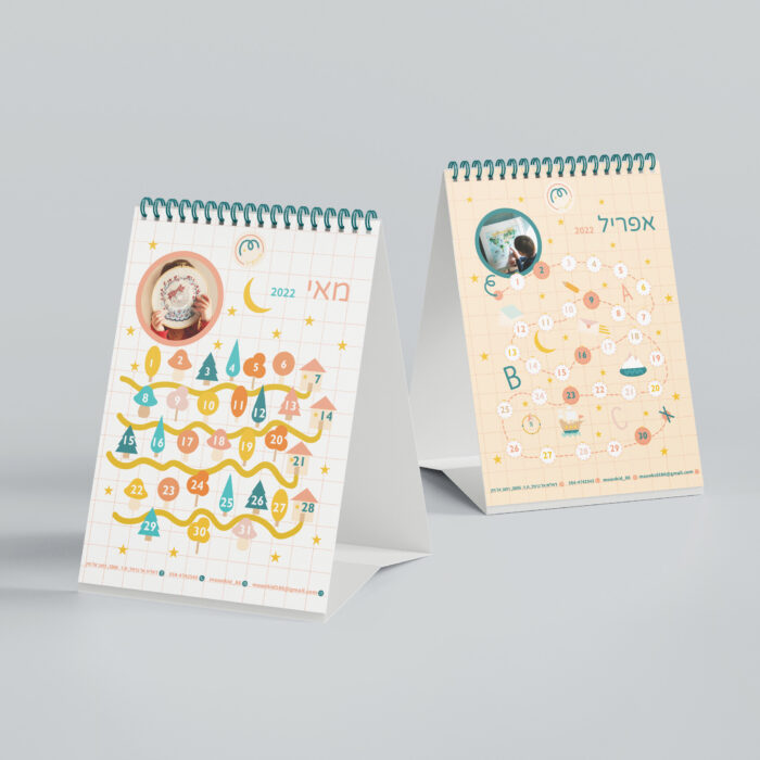
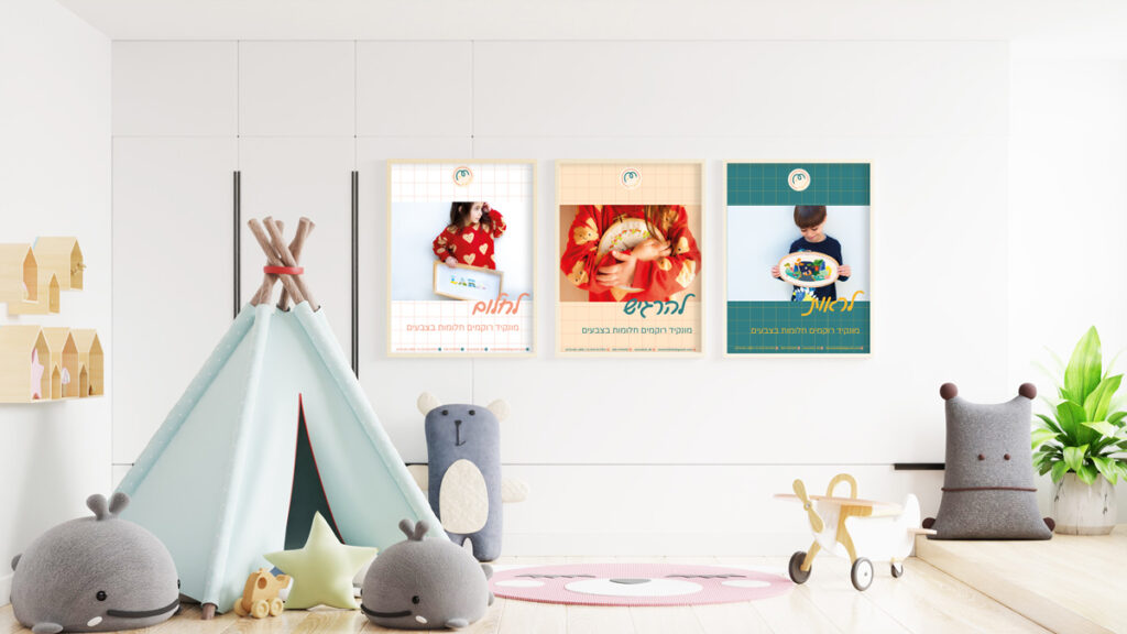
In the Moonkid Branding project, I created a new identity for a kids’ design store.
The store specialize in creating personalized art & design items for kids (and adults)
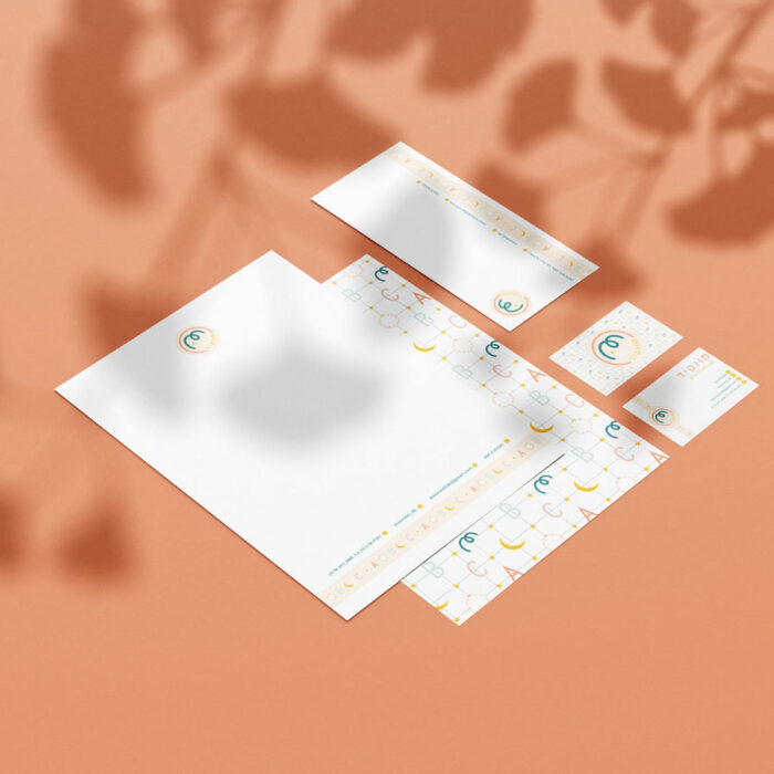
I designed the whole project from logo color palette and final products.
The store specialize in creating personalized art & design items for kids (and adults)
I designed the whole project from logo color palette and final products.
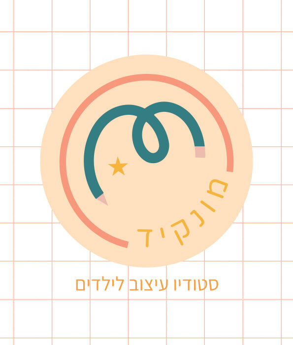
Insparations
The insparation board with some images that represent childhood feeling and some of that magic and dreams.



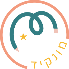
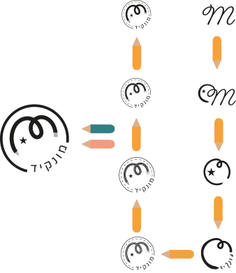
The logo design
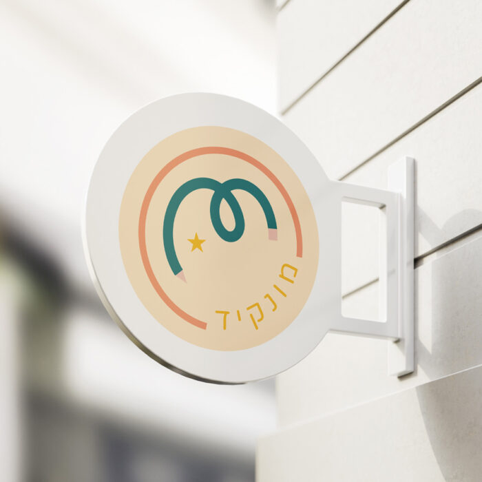
- designing a simple yet very unique logo wasn’t an easy task. to design the logo I looked back to the name of the business “Moonkid” as a reference and try to find a playful way to present the logo.
- I picked these elements :
- circle = shape of the full moon.
- Pen = represents art and creativity.
- Thread = represents one of the main products business.
- M= The first letter of the name of the business and owner.
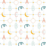
Color Paletta & Patterns
Three colors were chosen;
The Pink, is a warm and peachy pink that represent inoccence and happeniss.
The Teal, made of blue and green, stands for freedom and nature.
Last one is Light Yellow Ocher, this color is golden, represents fun and neverending energy.

#367D82

#F5AD41

#F69C7B


Elements
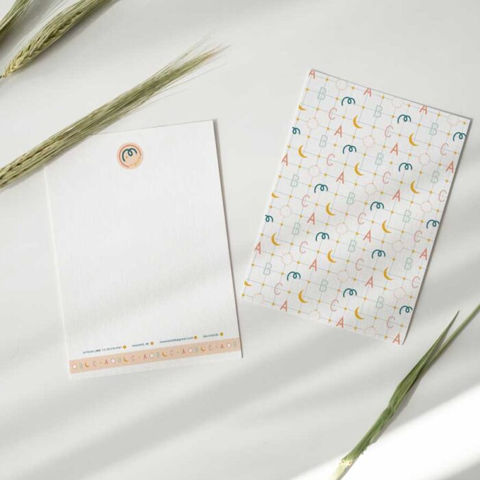
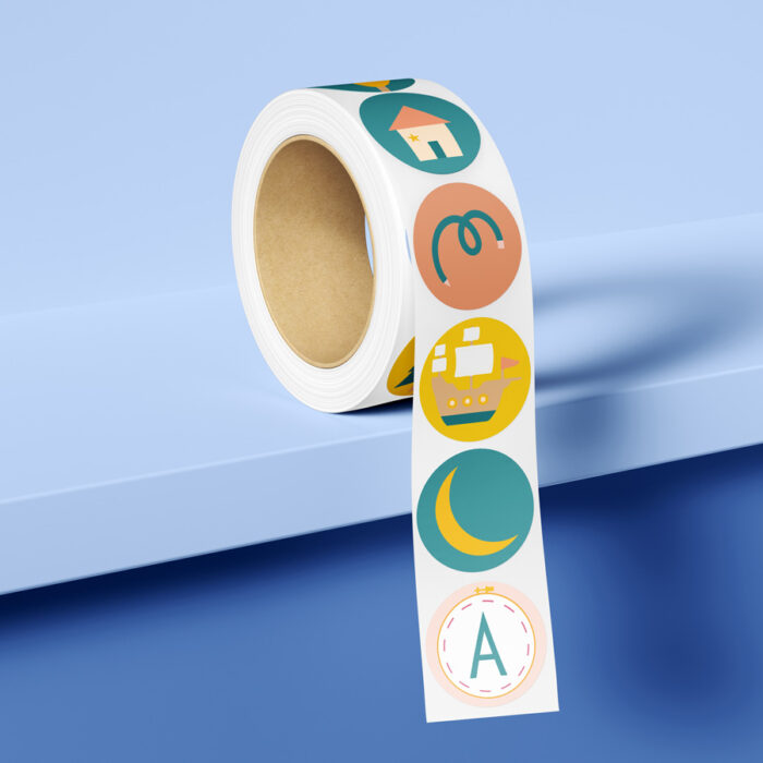
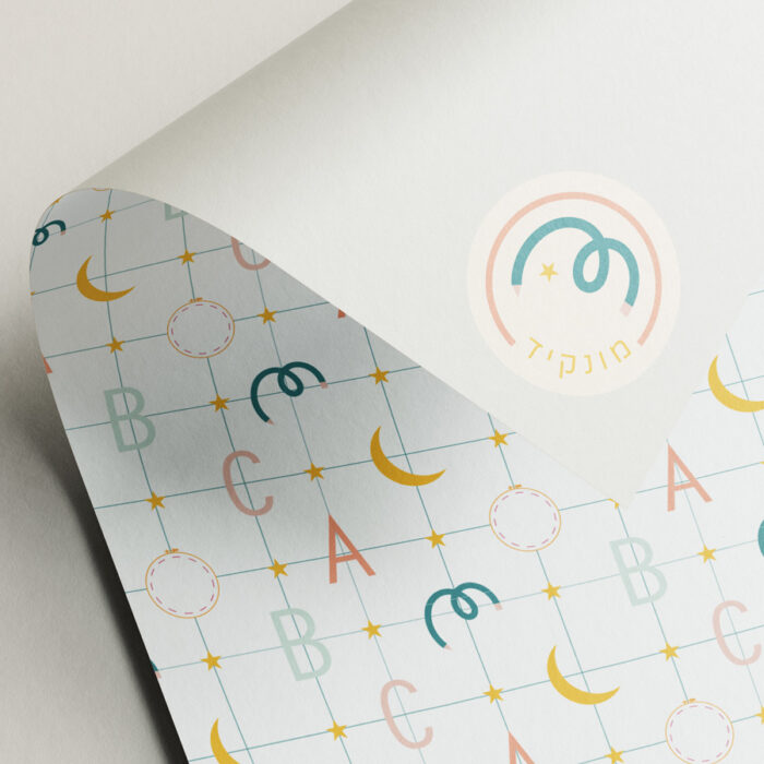
I created these elements from simple shapes, to match the theme of the project I chose elements from childerns’ stories.
Fonts
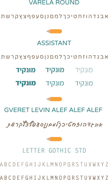
4 fonts were used in this project.
from the san-serif family and script.
I chose these fonts for they are rounded without pointy edges, to send a much smoother and flowing message.
the soft edges echoes the logo and the project theme.
Design Softwares


Mockups Gallery
